The Customer Connect Success Plan is a new feature to VMware customers. It was released in 2021 to rave reviews from both internal and external users.
Its function is to help Success Executives give personal step-by-step mentoring to VMware users on the many products they have purchased.
Check out the video presentation:
Check out the video presentation:
After logging in, the user is taken to the dashboard. You can get anywhere from here.
When a user first clicks into their Success Plan from the Customer Connect dashboard, they will be greeted by a welcome video and onboarding informational pdfs. It may take a few weeks for the Success Plan to come together.
After a few weeks, the Success Plan dashboard changes as information has been added!
Quick views are offered here on the dashboard under each Objective.
More Objectives are added and Achievements are completed throughout the months.
When a user clicks in to see more Objective details, they are brought to the My Success Plan page which
gives them a filtering option to see Task statuses more quickly.
gives them a filtering option to see Task statuses more quickly.
CONNECT SUCCESS UPDATES 2.0
After the initial Connect Success page was launched, new features were added. Below are the 2.0 designs.
The new dashboard has a more graphic feel to help users quickly identify the info they need. Tabs at the top of the page were added as well to quickly switch between all the new features and information.
The new dashboard has a more graphic feel to help users quickly identify the info they need. Tabs at the top of the page were added as well to quickly switch between all the new features and information.
The new Success Plan designs. All Objectives are shown and can be filtered.
Success Plan Objectives with the Tasks section expanded.
Success Resources are documents, videos, workshops, etc that users can open and learn from in order to more easily complete their Tasks and Plan Objectives. They are custom-made for each users' needs.
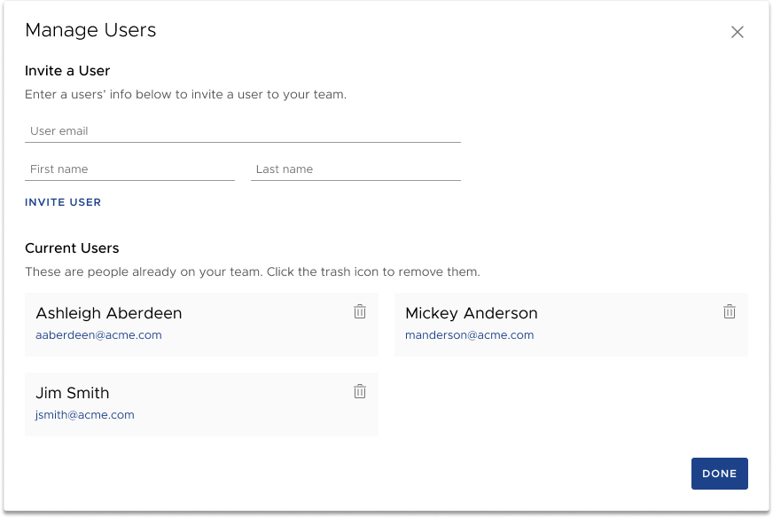
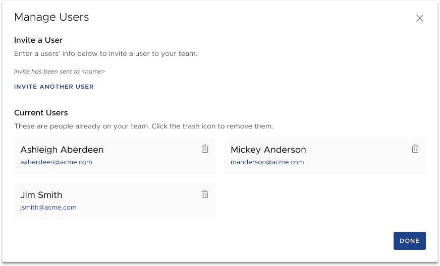
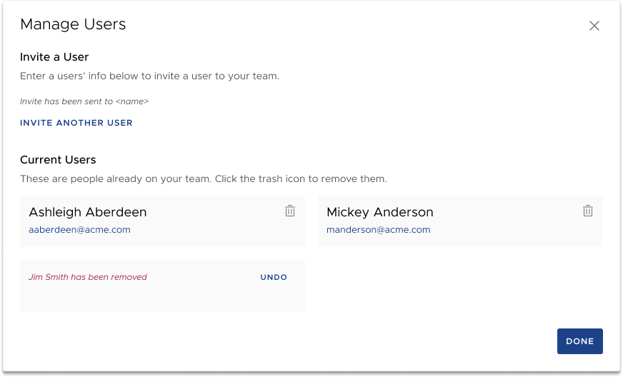
The Success Team are made up of both internal (VMware) and external users. Here the users can be added or deleted from the Success Plan.
The Manage Users modal.


CONNECT SUCCESS UPDATES 3.0
After speaking with my Project Manager with my concerns that the design was beginning to a look a little whimsical with so much color, I asked what the bare minimum amount of information was we could get away with for this high-level view/snapshot.
I ended up removing some cards and consolidated information. I also added a new section for a learning materials summary (Adoption Guidance...) which ties into information in the Success Resources tab.
I think it looks far more professional and easier to digest. My design philosophy is The Simpler The Better. Let's Marie Kando this and ask "What brings joy?" and "Do we really need this". The end result always ends up being a much better user experience!
